|
|
PROGRESS AND PERFORMANCE
ECONOMIC
Increasingly Dominated by Aggressive Financialization
|
|
The takeaway from the following graphs is that decision makers have been able to make decisions that delivered enormous rewards to owners (investors) while the people who work in the USA (and other mature Western democracies) have been increasingly disadvantaged compared to prior decades. This is the result of financialization and what one must expect as long as the dominent measure of economic success is money profit and economic wealth accumulation.
|
|
WHAT'S WRONG WITH GDP
|
There is a strong correlation between GDP and quality of life in poor economies, and for most of history all economic has been poor shortage economies. In this situation, GDP is a reasonable proxy for quality of life, but it sends the wrong signals about economic performance in richer mature economies and especially modern surplus economics.
After the 1970s GDP has not been a good proxy for quality of life in rich mature economies like the United States, Canada, many countries in Europe, and Japan.
Robert Kennedy and others have opined on this going back 50 years or more. This is what Robert Kennedy said in 1968 shortly before he was assassinated:
|

|
|
GENUINE PROGRESS INDICATOR (GPI) IS A BETTER MEASURE
|

|
Until the late 1960s there was strong correletion between per capita Gross Domestic Product (GDP) and the Genuine Progress Indicator (GPI), but this ended with the economic downturn of the early 1970s and the oil shock of 1973 whcih resulted in stagflation and cost push inflation. Higher costs showed up as bigger GDP, even while actual physical economic activity was declining
After 1980, there was a new political imperative ... 'Reagonomics' ... where deregulation and profit became the dominant policy rather than a more balanced set of socio-economic goals.
The cost push inflation of the 1970s was ended in large part by the expansion of offshore manufacturing especially in China and an offsetting reduction of high wage US manufacturing. This resulted in much improved corporate profit performance, while causing considerable social disuption with substantial social damage in the United States and significant poverty reduction in low wage cost countries like China and some others mainly in Asia.
|
PROFITS HAVE BEEN INCREASING BUT WAGES HAVE NOT
For almost 40 years since 1980 years there have been corporate profit increases, but almost no increases in wages!
|
|
Corporate Profits -v - Wages as a percent (%) of GDP!
|

|

|
1970 to 2012
This graph shows that relative to GDP, there has been a continuous trend of wage decline since 1970.
Corporate profits did not improve in the 1970s. At the end of the 1970s the economic situation was very tense with inflation out of control and interest rates around 20%. This situation was stabilized in the early 1980s and by the 1990s profits relative to GDP started to increase and this trend continued until 2012 with a downward blip around 2000 with the 'dot com bust' and a bigger blib as a result of the financial crisis on 2008.
Massive measures to 'save' the financial system translated into record levels of profit relative to GDP in the years after 2008.
|
2000 to 2012
There has been a continuous trend of wage decline since 1970. There was a modest improvement in the wage situation in the 1990s prior to the 'dot com bust', but since then the wage decline relative to GDP accelerated.
|
|
'https://econographics.wordpress.com/2013/03/05/corporate-profits-vs-wages-as-percentage-of-gdp/'
|
Open external link ...
|
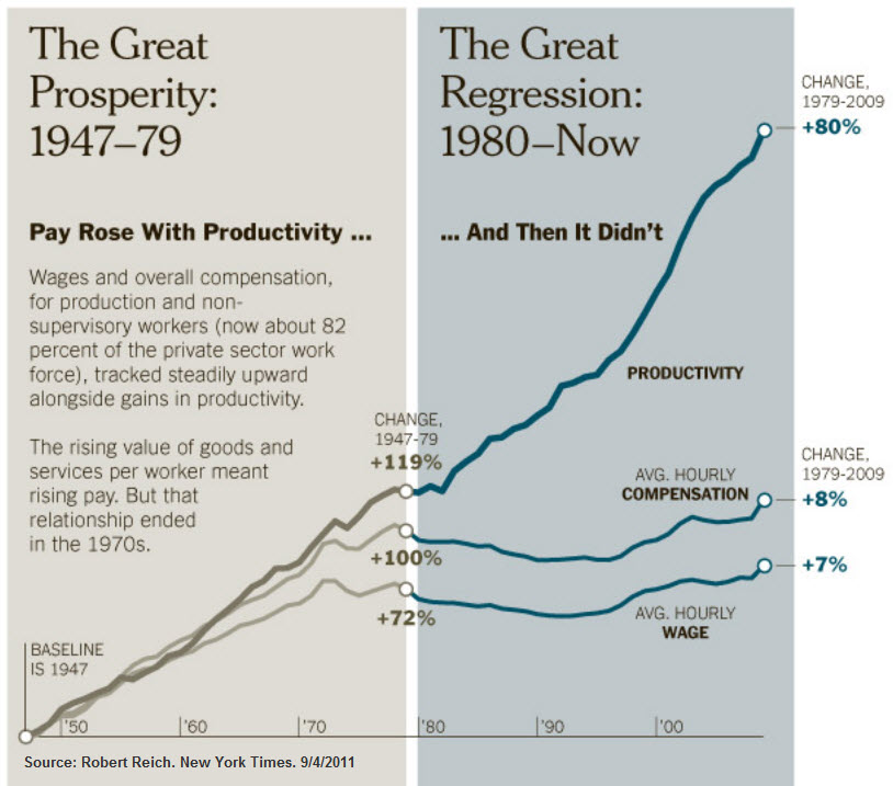
WAGES, PROFITS AND PRODUCTIVITY
50 years of increase in productivity and profits, little or no increase in wages!
|
|
Productivity up ... Wages down!
|

|
|
|
A plot of productivity versus wage growth shows that since about 1975 NONE of the benefit of increased productivity has gone to improving wages ... ALL of it has gone to profits and to the benefit of owners.
|
This graphic prepared by Secretary Reich in 2011 shows the same basic information ... that NONE of the benefit of increased productivity has gone to improving wages ... ALL of it has gone to profits and to the benefit of owners. For more than 30 years all the benefits of improved productivity has gone to owners, with none going to those that work.
In contrast, in the period 1945 to 1980 the growth of productivity was shared equitably between investors and workers.
|
|
Corporate Profits versus GDP versus Labor Wages
|

|
For the period 1970 to 1985, GDP has increased modestly year over year with a modest pull-back in 2008 due to the financial crisis.
Labor income has has also increased over the same time period.
For the period 1970 to 1987 corporate profits increased very little, but after this profits increased substantially. There were short blips in the profit increase trajectory during the dot com bust around 2000, and a bigger one caused by the financial crisis of 2008.
|
|
What has Caused Inequality? How Can it be Fixed?
|
The root cause of inequality is very simple. The people at the top are getting paid too much, and the people at the bottom are being paid too little.
The solution is also very simple. People at the top must be paid much less and people at the bottom must be paid much more
Why has this not been happening? The people at the top are making all the decisions, and the decisions are always in their own best interest.
This is unsustainable ... and some guts from leadership is urgently required. There is not much evidence of this now or for the past several decades!
|
INVESTMENT INCREASES PROFIT
Investment does much less for GDP growth because it contributes to a decline in aggregate demand and consumption
|

|
This set of data (from Andrew McAfee) shows a modest growth in GDP for the USA from 1995 to 2011. In this period corporate investment increased but dropped as the economy went into a short recession after the post Y2K tech boom and again in the so called 'great recession' of the period 2007/8/9.
Non financial profits after tax has grown stongly from 1995 to 205 but with signficiant fluctuations with big drops in the 2000 recession and again in the great recession a few years later. Total profits after tax did not fluctuate as much as the financial sector fluctuated less even though it had a huge role in the financial crisis that was responsible for the great recession.
None of these economic indicators suggests an economy and a society in trouble ... rather it looks like a set of trends that are really quite good.
|

|
The problem is that when the productivity / worker trends are added in (the red line) then it shows that the achievements of the economy are being obtained with less and less participation of workers. It comes as no surprise that a political candidate such as Donald Trump is able to attract votes based on a promise of change, when a very large proportion of the country's workers are 'losing' relative to the more advantaged in the society.
This is very basic economic analysis that seems to have been ignored by politicians, policy makers and the media for a very long time.
|
|
Financial Sector Assets
|

|
A big part of the wealth of the United States has been created not so much by the ownership of physical assets, but by the ownership of financial assets.
From 1950 to 1980 there was a relatively slow increase in financial assets relative to the growth of GDP, from about 130% of GDP to around 170% of GDP according to the Federal Reserve.
In the four decades since 1980 the increase in financial assets has been much more rapid, increasing from about 170% of GDP in 1980 to around 470% of GDP in 2010. This has been the result of financial engineering orchestrated by the banks and financial intermediaries rather than investment in the real assets of the economy that are essential for a sustainable future.
|
|
INTERNATIONAL DEVELOPMENT FINANCE
|
|
Funding Development Assistance
|

|
The changes in the structure of development financial flows over the past 40 years mean that developing countries are going to be less and less able to achieve independent sustainability.
This ought to be a matter of great concern, but the discussion is muted. Official Development Assistance (ODA) has remained at about the same level for several decades, even though there has been a much greater need for ODA than supply.
However, various forms of debt financing and foreign direct investment have increased substantially. The expectation with these modes of financing is that there will be a 'return' from these investments that is a risk adjusted market rate. In most cases this will be substantially more than the underlying increase in the productivity and performance of the economy ... and the basic arithmetic is that the country gets poorer rather than richer as a result of the financial interevention.
The good news is that personal remittances have grown substantially. These fund flows have a very positive impact on the quality of life of the beneficiaries. Sadly remittances are also the target of politicians who have an interest in taxing these fund flows.
|
|
MONEY ... THE DECLINING DOLLAR
|

|
At any moment in time the absolute value of a unit of money does not matter very much, at any rate when money is being used as a unit of measure in a transaction. If money is being used as a store of value over time, then changes in value matter very mugh.
There were substantial drops in the value of the dollar during the First World War and the Second World War. In both cases there was massive 'inflation' caused by excessive demand for war materials ... demand pull inflation and related production profits.
Global production profits have continued to fuel demand pull inflation since the 1980s. During the 1970s following the global 'oil shock', there was cost push inflation.
Some economists attribute the decline in value of the dollar to the creation of the Federal Reserve Bank in 2013. More likely is that the decline in the value of the dollar is attributable to the changes that have occurred in the underlying economy of the United States and the World.
|
|
US FEDERAL DEFICIT AS % OF GDP
|

|
In the 1980s and the early 1990s, that is during the Reagan years and into the Bush senior years there were US Federal Government deficits. These came down during the Clinton years and the dot com boom and there were a few years of Federal Government surplus.
This ended in the early Bush 43 years not helped by the Bush-Cheney-Rumsfeld-Rice post 9/11 war on terror, and then aggravated by the financial crisis of 2008. After the huge deficit of 2009 rhe Obama administration reduced the US Federal deficit substantially and set the stage for more fiscal sustainability in the future. Post Obama, government spending once again seems to be out of control with expanding deficits caused primarily by expanding military outlays and corporate tax reductions.
|
|
https://econographics.wordpress.com/2014/03/06/federal-budget-deficit-percent-of-gdp/
|
Open external link
|
|
IMPACT ON ECONOMIC CAPITAL
|
|
FINANCIAL CAPITAL
|
PHYSICAL CAPITAL
|
INTANGIBLE CAPITAL
|
INVESTMENT

|
BULLS

|
BUILDINGS

|
STEEL MFG.

|
SECURITY

|
CULTURE

|
FINANCIALIZATION
FINANCIAL ENGINEERING / INVESTMENT / MONEY and LIQUIDITY
|
INVESTMENT
STOCKS UP

Stock market has been up
|
SPECULATION
MONEY DOWN

Buying power of the US$ is down
|
Both the USA and the UK have a very creative financial sector and have led the world in the development of financial instruments and what is increasingly referred to as 'financialization'.
It is not entirely clear whether 'financialization' has been good or bad since the metrics used are inadequate. There are many 'aggregates' that show 'bigger' but it is less clear whether this is a good proxy for better. There are many indicators in the following commentary which suggest that while the aggregate is big, the underlying makeup of the aggregate comprises relatively few who have done very well and a much larger number of people who have not.
|
|
|
|
|
MONEY BASE

Monetary base has expanded since 2008
|
MONEY

US$ has has massive value loss over time
|
MONEY DOWN
... but the buying power of the US$ is way down
|
WAGES FLAT

and wages flatlining while productivity grows.
|
GDP -v- GPI

While GDP is up, progress (GPI) is flat
|
- The financial economy has grown robustly since the 1980s.
- Amazing innovation has been deployed mainly to improve profit performance.
- The huge expansion of financial wealth is excessivly concentrated.
- Concentration of economic power by both individuals and corporate organizations has come at the expense of everyone else.
- A lot of people are 'mad as hell' and don't intend to take it any more.
|
|
MONEY / LIQUIDITY
|
|
Stock market
|
Intangible value

|
Money supply

|
World GDP growth

|
US GDP growth

|
GDP v GPI
|
|
Without money / liquidity, the system stops working ... or never gets started
|
- The money system is very powerful, and difficult to understand.
- Some commonly held beliefs are wrong.
- It is unclear if any of the proposed better systems would be any better.
|
|
|
Value of $ down
The buying power of money has declined dramatically over time ... likely because of a systemic flaw in how the money system works
|

|
Stacks of 50-subject one dollar note sheets at the U.S. Bureau of Engraving and Printing in Washington on April 14, 2015. (Andrew Harrer/Bloomberg)
|

|
Cut stacks of $100 bills make their way down the line at the Bureau of Engraving and Printing Western Currency Facility in Fort Worth, Texas. (AP Photo/LM Otero)
|
|
UK Bank Lending by Sector from 1997 to 2012
|
|
|
UK bank lending grew along with the size of the British economy from 1997 to around 2007, at which point there was a surge in lending to the financial and real estate sectors ... and a subsequent banking crisis as these loans proved unviable.
What is particularly concerning is that the lending to non-financial businesses ... what one might describe as the 'real economy' which produces the goods and services that we all need to live our lives, has flatlined for this period, as it has done for a very long time before this period.
|
|
Economic and financial metrics going up ...
|
|
|
US GDP growth
|
|
|
World GDP growth
|
Stock Market ... New York Stock Exchange

|
The value of stocks listed on the New York Stock Exchange as measured by the S&P500 has increased substantially in the period from 1980 to 2016. There was an increase in the 30 year period from 1950 to 1980 but nothing like what happened since 1980.
There are multiple reasons for the increase in market valuation. Together the reasons may be referred to as the financialization of the modern economy.
Since 1980 very little of the economic surplus arising as a result of improved corporate productivity has been shared with workers. Almost all of this improvement has gone into improving corporate profits. The accumulation of wealth arising as a result of corporate profits and increase in related stock valuation has been faster than at any previous time in history.
It is worth noting that one of the periods of fastest stock value growth was during the Clinton administration. The so called 'dot.com' bubble deflated early in 2000 in the early days of the Bush (43) administration, and then recovered again until 2008 when there was a catastrophic collapse brought about by unconstrained loan abuses by the banking industry and creative financial instruments going wrong.
|
|
|
Intangible value
|
|
|
Money supply
|

|
Balance sheet cash
|
|
|
Price of Gold in US$ ... 1960 to 2016
|

|
President Nixon took the US off the 'gold standard' in the 1970s. Since then the price of gold measured in $ money has increased dramatically. But what does this mean? More than anything else it
probably means that modern money should not be trusted ... at any rate, not as a store of value!
|
|
GDP up ... Profits up ... But NOT wages
|

|
For the period from 1980 to 2015, the bottom 50% of the US population has shared less and less of the total GDP while the top 50% has been increasing its share.
Early in the 1980s President Reagan made it much more difficult for workers to benefit from collective bargaining, and over time profits have increased while wages have not. Not surprisngly, workers are 'mad as hell' and want the situation changed.
|
These graphs confirm the hypothesis that in order for the economy to be optimized for ALL the population there must be measures to reflect quality of life for everyone, and not merely a single simple measure that really only works for those with affluence. In other words, the top purpose of economic activity should be improving the quality of life for people, with the least possible damage to the environment and least degradation of economic capital. Metrics for progress and performance should reflect this purpose!
|
|
|
|
