Date: 2025-01-15 Page is: DBtxt003.php txt00012012
Population
Population Distribution
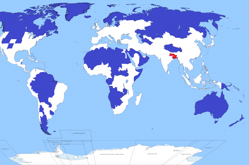
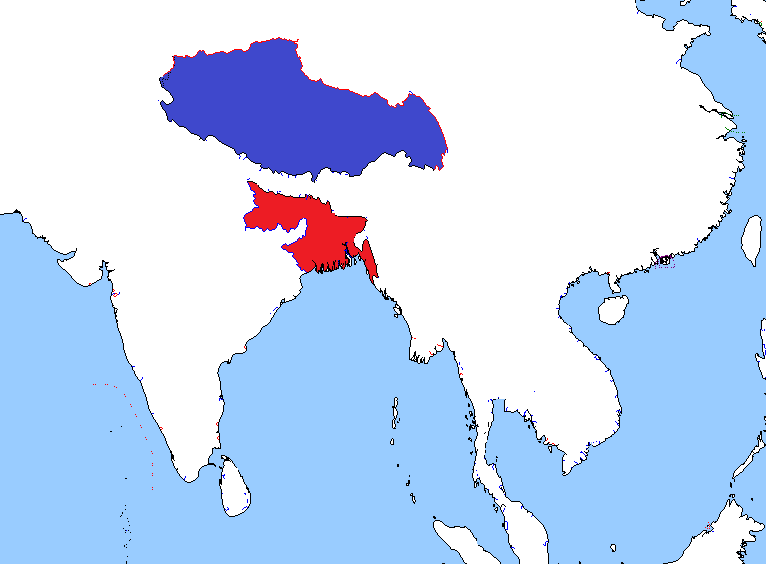
The area of this map coloured red has the same population as the area coloured blue
Burgess COMMENTARY
Peter Burgess
The area of this map coloured red has the same population as the area coloured blue

One of these things is, well, quite like the other, actually. Image: Ibisdigitalmedia.
Well, this is kind of crazy. Only 5 per cent of the world's population lives in the regions of this map shaded blue. Another 5 per cent lives in the area shaded red. Yoinks.
The image appeared on the MapPorn section of Reddit earlier this week, the only post made by an account called “IbisDigitalMedia”, and swiftly started racking up the up votes. It's not entirely clear who or what Ibis is – it might be a Dallas video production firm specialising in wedding videos, as unlikely as that seems – but since they’re clearly a corporate seeking viral marketing, we figured they wouldn't mind a reputable urbanism website reposting their map with a bit of commentary attached.
So, this is what we’re looking at here. The red area includes Bangladesh (pop: 156m), and the Indian states of Bihar (pop: 104m) and West Bengal (pop: 91m). It also includes two megacities: Kolkata in West Bengal (15m), and the Bangladeshi capital of Dhaka (13m).

In all, that’s a combined population of about 351m people in roughly 330,000 km2, giving a population density of 1062 people per km2. By way of comparison, the most densely populated country in Europe is the Netherlands. The density there is less than 500 people per km2.
The blue area includes – this list is not exhaustive, but still, take a deep breath before we get into it – Canada, Greenland, Iceland, Norway, Sweden, Finland, Estonia, Latvia, Lithuania, huge swathes of northern and Asian Russia, Mongolia, most of the Amazon basin, Patagonia, large swathes of Africa and the Arabic peninsula, the US states of New Mexico, Nevada, Utah, Kansas, Nebraska, Idaho, Wyoming, Montana, and both Dakotas, and pretty much the entire Australasian continent.
We haven’t done the maths on this – I mean, how? – but we’re taking it on trust that this is roughly 350m people, too. There are just over 7bn people in the world.
These less populated areas are largely, but not exclusively, the bits that aren’t all that fit for human habitation: deserts, steppes, tundra, rainforest. We're pretty sure it doesn't include a single megacity: the closest candidates appear to be Luanda, the capital of Angola (6.5m) and Toronto (6.0m).
The map is a bit of a cheat. We're assuming that whoever made the map calculated how many people 5 per cent of the global population is, and then started working their way down a list of big areas with low population density until they hit their magic number. It’s a slightly artificial way of doing things, and leads to odd things like the exclusion of the Nile valley and the thin sliver of South America on its populated Pacific Coast.
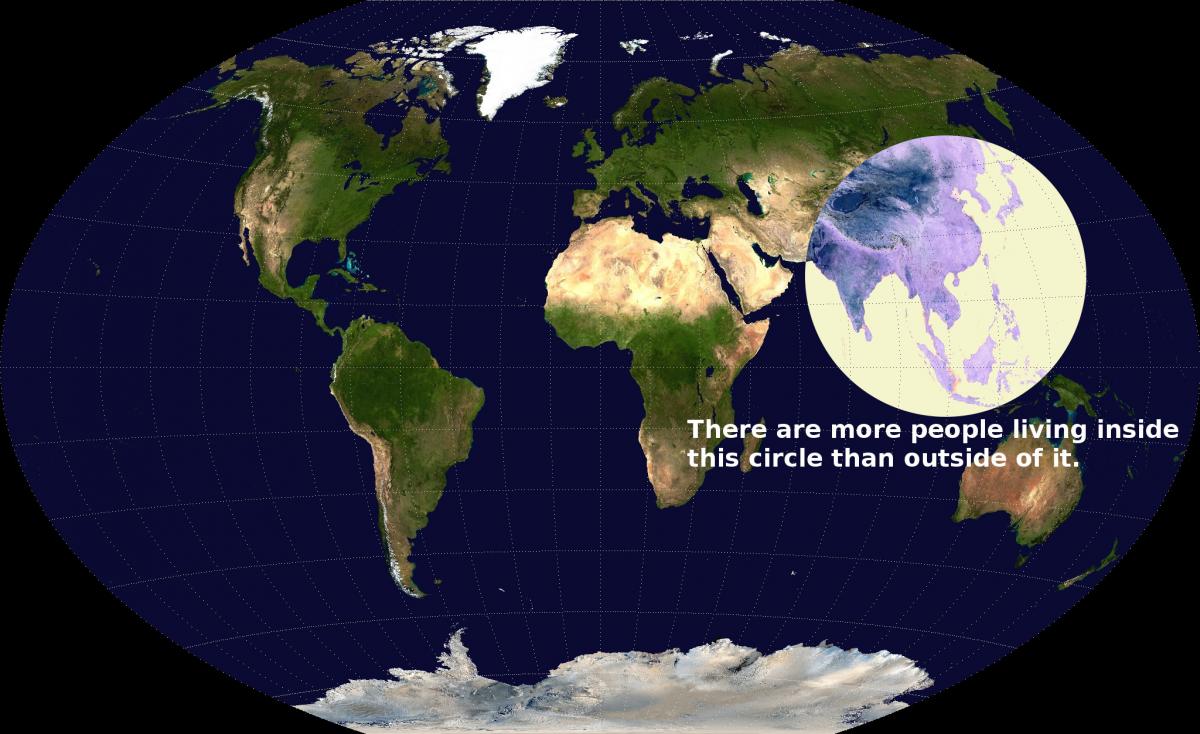
It reminds us of this map, from another Redditor, valeriepieris, which is in its way more striking because it doesn't cherry pick what it shows in this way:

Anyway. The world’s population is really unevenly distributed, that’s the point here. It’s the old 53 per cent of the world’s population live on 3 per cent of its surface thing at work, once again.
One last thought. That red area is at enormous risk from sea level rises. If climate change has the effect that scientific consensus imagines it will, where are those 350m people going to go?