
Date: 2024-07-17 Page is: DBtxt003.php txt00014481
US Economic Performance
Trends thru 2017
Top charts of 2017 ... 12 charts that show the real problems policies must tackle, not the made-up ones
Burgess COMMENTARY
Good to see these graphics ... they confirm what is really fairly well known. The challenge is for these issues to be addressed in a meaningful way. I have argued for a long time that this is a management problem that needs to be addressed using the same sort of tools that are used within the corporate organization when there is a problem with profit performance. In my own experience in corporate management one of the key additional pieces of information is to get not just the 'point' data but the profile of the data. With this it is possible to do things that eliminate the bad parts of the profile and to encourage things that are on the good side of the profile. This sort of disaggregation is vital. After that there is a need to give feedback about progress or not. Where there is progress, how did it happen and how can it be speeded up. Where there is no progress or slow progress, what is constraining the progress. Everything should be data driven ,,, and progress celebrated.
Peter Burgess
Top charts of 2017 ... 12 charts that show the real problems policies must tackle, not the made-up ones
Inequalities, and the inequities in opportunity that they represent, permeate all areas of American society. The real problems policies must tackle include stagnating wages of American workers who have lost economic leverage, wage and wealth gaps based on race, and unequal educational opportunities for children from lower-income families. Unfortunately the policy focus on the last year, culminating in the end-of-year passage of massive tax cuts for corporations, addressed nonexistent problems rather than the real problems we face. EPI’s Top Charts of 2017 tell the story in images.
When workers have more leverage, income growth is more equal
Union membership and share of income going to the top 10 percent in the U.S., 1917–2015
1 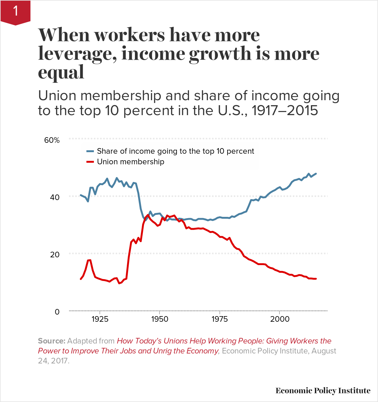
ChartData
Source: Adapted from How Today’s Unions Help Working People: Giving Workers the Power to Improve Their Jobs and Unrig the Economy, Economic Policy Institute, August 24, 2017.
The U.S. economy is more equitable when workers have the freedom to join together and bargain collectively through a union. The bottom line in the graph shows a sharp rise in union membership after enactment of the National Labor Relations Act (NLRA) in 1935. (The NLRA itself was the outcome of an explosion of worker organizing around 1920). For decades the NLRA protected workers’ rights to negotiate with their employers—rights that workers used to secure a fairer share of overall income generated in the economy. This worker leverage led to decades of fast and equitable economic growth that persisted through the 1970s. The top line in the graph shows that the top 10 percent of Americans collected almost half of all income in the late 1920s and early 1930s, but only around a third by the 1950s, when union membership was at its peak and gains were spread more evenly to the bottom 90 percent.
In the 1970s fierce corporate opposition to unions, coupled with policymakers’ failure to protect private-sector workers’ collective bargaining rights, led to policies and practices that strangled union organizing in the private sector. The rapid de-unionization that ensued contributed to wage declines for all workers and reversed much of the economic progress that had been made by the broad American middle class in the decades following World War II. While the NLRA still protects workers’ rights to unionize, the law has not kept up with the onslaught of employer anti-union practices. The graph shows that as union membership declined, the top 10 percent’s share of all income rose, returning to Great Depression levels by the 2010s.
Janus v. AFSCME, a case that will be argued before the U.S. Supreme Court in February 2017, could accelerate growing inequality. A decision in favor of the plaintiff in Janus would outlaw mandatory fair share fees in the public sector—letting nonunion members in a school or fire department or other public workplace benefit from union representation but not pay for it. This opens the door for employers to use fear and intimidation to erode financial support for—and thus membership in—public-sector unions the same way that anti-union legislation (such as so-called “right-to-work” laws) has eroded union membership in the private sector.
Share this chart: Share Tweet Embed Download image
2 ... Working people saving for retirement are losing billions
The administration has delayed a rule protecting retirement savers against financial advisers with conflicts of interest
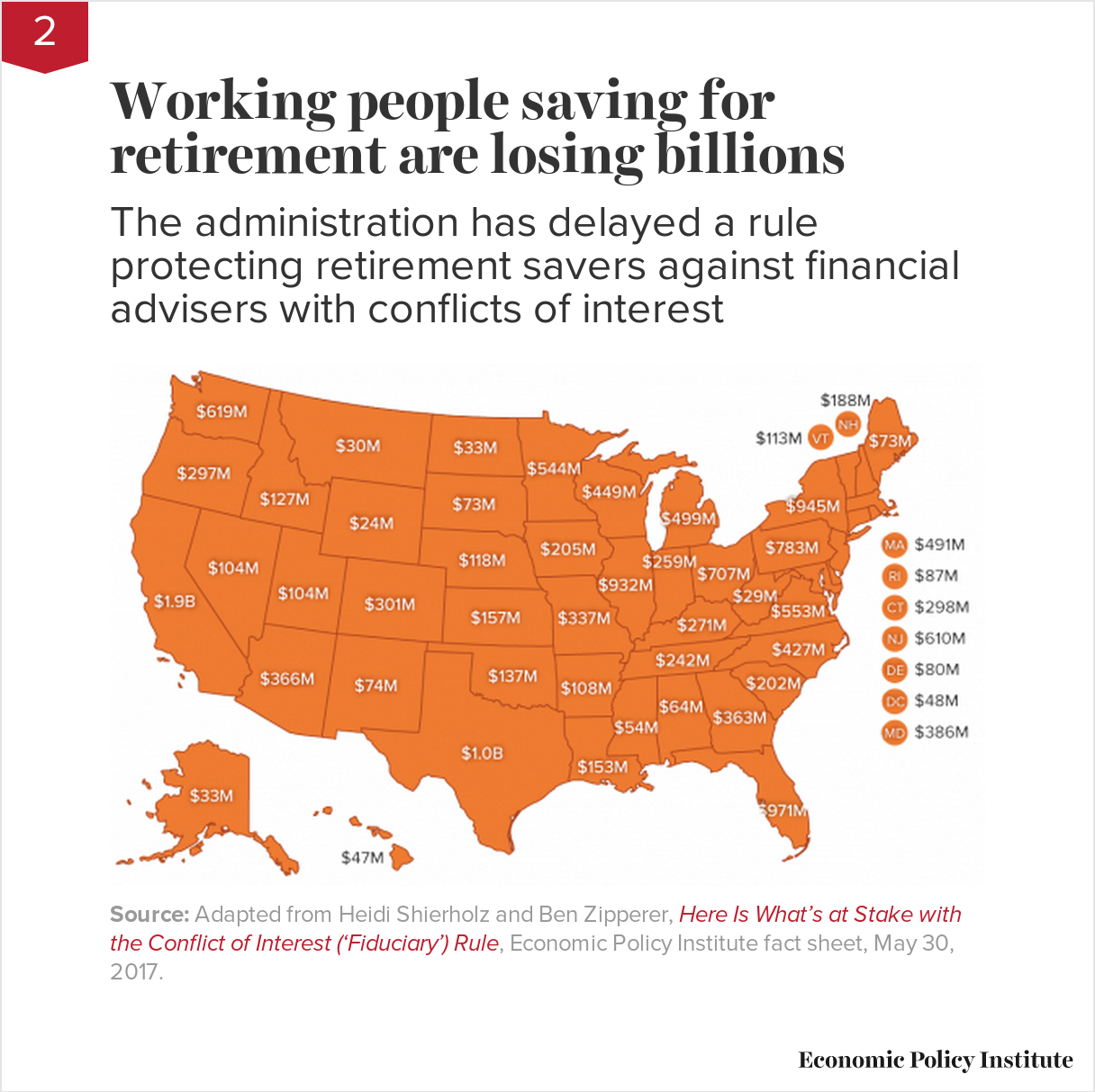
Working people saving for retirement are losing billions: The administration has delayed a rule protecting retirement savers against financial advisers with conflicts of interest
Source: Adapted from Heidi Shierholz and Ben Zipperer, Here Is What’s at Stake with the Conflict of Interest (‘Fiduciary’) Rule, Economic Policy Institute fact sheet, May 30, 2017.
The fiduciary rule is an Obama-era regulation that protects Americans’ hard-earned retirement savings by requiring that financial professionals offering retirement investment advice put their clients’ interests first. The rule was supposed to be implemented on April 10, 2017. But the Trump administration has repeatedly delayed enforcement of the rule, most recently to July 1, 2019, and is using the rule-making process and delays to significantly weaken the rule.
Because of the enforcement delays, industry actors presenting themselves as neutral advisers can continue to steer retirement savers to products with high fees and commissions that benefit the advisers but reduce net returns for the client. The map shows the annual costs retirement savers in each state incur due to underperforming IRA assets that are invested in products for which savers received “conflicted” advice (that is, advice provided by financial advisers whose earnings depend on the actions taken by the client).1
EPI has used the data on annual losses to retirement savers from conflicted advice to estimate that an August 2017 Department of Labor directive delaying the rule for 18 months, to July 1, 2019, would cost workers saving for retirement $10.9 billion dollars over the next 30 years.
1. Underperformance of investment returns in which savers received conflicted advice can be attributed to a wide range of factors, including high fees, high trading costs, poor market timing, and increased risk exposure without increased returns.
Share this chart: Share Tweet Embed Download image
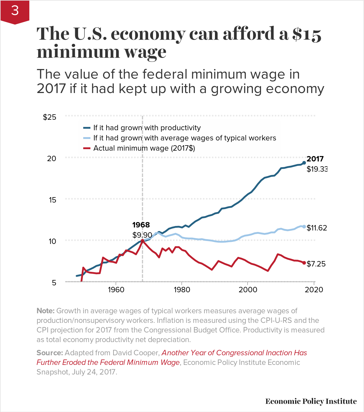
3 ... The U.S. economy can afford a $15 minimum wage
The value of the federal minimum wage in 2017 if it had kept up with a growing economy
ChartData
Note: Growth in average wages of typical workers measures average wages of production/nonsupervisory workers. Inflation is measured using the CPI-U-RS and the CPI projection for 2017 from the Congressional Budget Office. Productivity is measured as total economy productivity net depreciation.
Source: Adapted from David Cooper, Another Year of Congressional Inaction Has Further Eroded the Federal Minimum Wage, Economic Policy Institute Economic Snapshot, July 24, 2017.
The federal minimum wage was established in 1938 to help ensure that regular employment provided a decent quality of life. By making periodic increases in the minimum wage, Congress also guaranteed that the country’s lowest-paid workers would share in the benefits of broader improvements in the economy. For the first 30 years of the minimum wage’s existence, regular raises allowed the minimum wage to keep pace with growth in economy-wide productivity. But, as the graph shows, since the 1970s Congress has failed to adjust the minimum wage to match the economy’s capacity for higher wages—leaving low-wage workers behind.
The bottom line shows how inflation has eroded the buying power of a minimum wage income even as the economy grew and was able to afford a higher minimum wage. If you were paid the $7.25 minimum wage in 2017, you made 27 percent less—in inflation-adjusted terms—than someone who earned the minimum wage in 1968 (when the value of the federal minimum wage peaked, at $9.90 in 2017 dollars). The middle line shows that if the minimum wage had kept up with average wage growth for typical U.S. workers (specifically, production and nonsupervisory workers, who constitute essentially the bottom 80 percent of the workforce) since 1968, it would be $11.62 an hour. But even that would not have been sufficient to distribute the fruits of economic growth equitably. If the minimum wage had kept pace with rising productivity since 1968, someone earning the minimum wage in 2017 would have received $19.33 an hour—and millions of people earning above the minimum wage today would also be getting higher wages than they currently do.
The expectation that the minimum wage rise in step with broader trends in the economy would not have been unreasonable for previous generations—that was the trend throughout the 1950s and 1960s. Today’s minimum wage workers have been harmed both by the failure to raise the minimum wage in step with pay for typical workers and by the huge and growing gap between these nonsupervisory wages and economy-wide productivity. The Raise the Wage Act of 2017 would raise the federal minimum wage to $15 by 2024. Such a raise would certainly bring the pay of minimum wage workers closer to providing a decent quality of life, even though it would still fall short of what the economy could have delivered for low-wage workers over the past 50 years.
Share this chart: Share Tweet Embed Download image
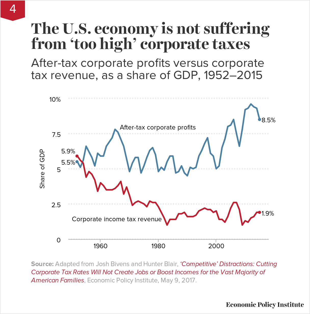
4 ... The U.S. economy is not suffering from ‘too high’ corporate taxes
After-tax corporate profits versus corporate tax revenue, as a share of GDP, 1952–2015
ChartData
Source: Adapted from Josh Bivens and Hunter Blair, ‘Competitive’ Distractions: Cutting Corporate Tax Rates Will Not Create Jobs or Boost Incomes for the Vast Majority of American Families, Economic Policy Institute, May 9, 2017.
In the recent tax debate, proponents of corporate tax cuts once again trotted out the myth that taxes on American corporations are excessive and are responsible for recent slow economic growth. These proponents claim that cutting corporate tax rates will encourage companies to make productivity-boosting investments that would increase wages. We’ve noted the many ways this claim fails when tested against real-world evidence.
But the simplest rebuttal to this claim is this graph, which shows that corporate taxes as a share of the U.S. economy have been extraordinarily low in recent years, even as corporate profits have been historically high. At a time when ginned-up hysteria over federal budget deficits is used to attack crucial social insurance and income support programs like Social Security, Medicare, and nutrition assistance, it is odd that we’d ask even less of corporations when it comes to collecting taxes.
Share this chart: Share Tweet Embed Download image
5 ... Cuts to social programs would push millions of Americans into poverty
44,566,000 people were in poverty in 2016—below are the additional number of people that would have been in poverty without the specified government program

ChartData
Notes: Poverty in this chart is measured by the Supplemental Poverty Measure (SPM). SNAP refers to the Supplemental Nutrition Assistance Program. The Supplemental Security Income (SSI) program pays benefits to adults and children with a disability and who have limited income and resources, and people age 65 or older who have limited income and resources. TANF refers to Temporary Assistance for Needy Families. WIC refers to the Special Supplemental Nutrition Program for Woman, Infants, and Children. LIHEAP refers to the Low Income Home Energy Assistance Program.
Source: David Cooper and Julia Wolfe, “Poverty Declined Modestly in 2016; Government Programs Continued to Keep Tens of Millions Out of Poverty,” Working Economics (Economic Policy Institute blog), September 12, 2017.
While taxes dominated the end-of-year agenda, cuts to the social safety net are looming. Republicans in Congress passed a budget resolution in October calling for draconian cuts to Medicare, Medicaid, and a number of key safety net programs like food stamps and Supplemental Security Income (SSI). In the wake of tax cuts providing huge benefits to the richest households and corporations, Republicans in Congress will likely assert that the federal budget deficit demands that we make these spending cuts. This predictable response would represent a triumph of chutzpah over economics. As past EPI research has shown, the deficit is not a pressing economic problem. But “deficit hysteria”—ginned up over decades by policymakers and analysts in both parties—could provide political cover for making cuts to popular social programs that would otherwise be politically impossible. This will devastate families that rely on these programs.
As the chart shows, these programs keep tens of millions of people out of poverty. For example, eliminating food stamps would push 3.6 million people, including 1.5 million children, into poverty, as measured by the Supplemental Poverty Measure. This cut alone would raise the total number of people in poverty to more than 48 million. Eliminating Supplemental Security Income would push 3.4 million people into poverty, including adults and children with disabilities. Eliminating housing subsidies would push 3.1 million people into poverty. (For more in the age breakdown of the population affected by these programs, see EPI’s expanded chart from September 2017, “Without government programs, millions more would be in poverty.”)
Share this chart: Share Tweet Embed Download image
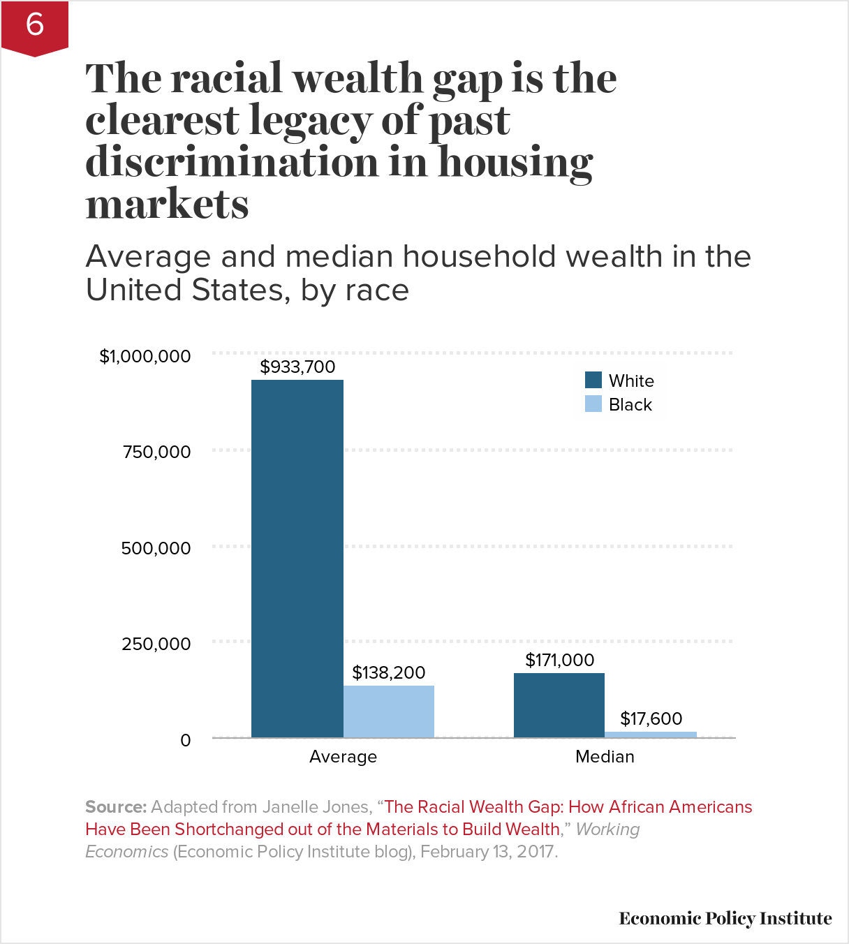
6 ... The racial wealth gap is the clearest legacy of past discrimination in housing markets
Average and median household wealth in the United States, by race
ChartData
Source: Adapted from Janelle Jones, “The Racial Wealth Gap: How African Americans Have Been Shortchanged out of the Materials to Build Wealth,” Working Economics (Economic Policy Institute blog), February 13, 2017.
The legacy of economic disadvantage for black Americans is apparent in the enormous wealth divide between black and white families in the United States. In 2016 the average white household had nearly seven times as much wealth ($933,700 in financial assets minus liabilities) as the average black household (which had a net worth of $138,200). This relative disparity grows when looking at “typical,” or median, households (those in the exact middle). In 2016, the net worth of the typical white household was $171,000, almost ten times the $17,600 in wealth held by the typical black household. What the chart does not show is that these gaps persist even after accounting for age, household structure, education level, income, and occupation.
These numbers are as disturbing for the past inequities they represent as for the future opportunity gaps they foretell. Wealth provides a buffer of economic security against periods of unemployment, enables families to finance a child’s college education or a new business venture, and helps finance a comfortable retirement. But African Americans have been shortchanged out of the materials to build wealth. Besides facing discrimination in employment and wages, black families historically have been shut out of the most important wealth-building market: housing. Overall, home equity makes up about two-thirds of all wealth for the typical household. In short, for median families, the racial wealth gap is overwhelmingly a housing wealth gap. And this housing wealth gap is no accident; it is the outcome of intentional policies at all levels of government, in particular housing policies that prevented blacks from acquiring land, created redlining and restrictive covenants, and encouraged lending discrimination. These policies created and reinforced the racial wealth gap we are still struggling to address.
Share this chart: Share Tweet Embed Download image
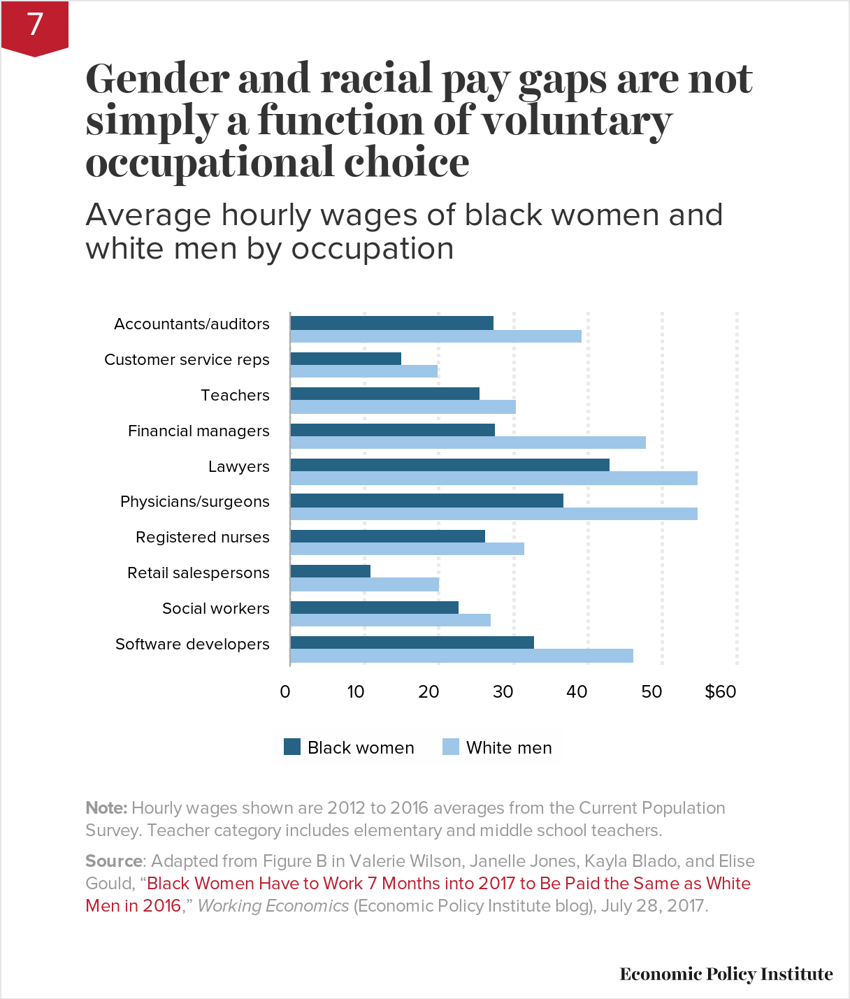
7 ... Gender and racial pay gaps are not simply a function of voluntary occupational choice
Average hourly wages of black women and white men by occupation
ChartData
Note: Hourly wages shown are 2012 to 2016 averages from the Current Population Survey. Teacher category includes elementary and middle school teachers.
Source: Adapted from Figure B in Valerie Wilson, Janelle Jones, Kayla Blado, and Elise Gould, “Black Women Have to Work 7 Months into 2017 to Be Paid the Same as White Men in 2016,” Working Economics (Economic Policy Institute blog), July 28, 2017.
On average, black women workers are paid only 67 cents on the dollar relative to white non-Hispanic men, after controlling for education, years of experience, and location (using 2016 data). This distressing statistic reflects the dual inequities faced by black women—they are subject to both a racial pay gap and a gender pay gap. A key focus of those committed to a fairer economy should be closing these gaps and accelerating economic progress for black women. A number of myths block steps toward real solutions, including the myth that racial and gender pay gaps are simply due to black women making unconstrained choices to pursue careers that pay less. In reality, occupational segregation is not simply a voluntary choice, but is clearly affected by discrimination both before and after people begin their careers. Further, racial and gender pay gaps persist even within occupations.
The chart shows the average wages of black women and white men in a range of occupations. In every occupation shown—both female-dominated and male-dominated—black women earn less than white men. White male physicians and surgeons earn, on average, $18.00 per hour more than black women doing the same job ($54.94 versus $36.94). The gap for retail salespersons is also shocking, at more than $9.00 an hour ($20.12 versus $10.99). The data confirm that black women are underpaid, period.
Share this chart: Share Tweet Embed Download image
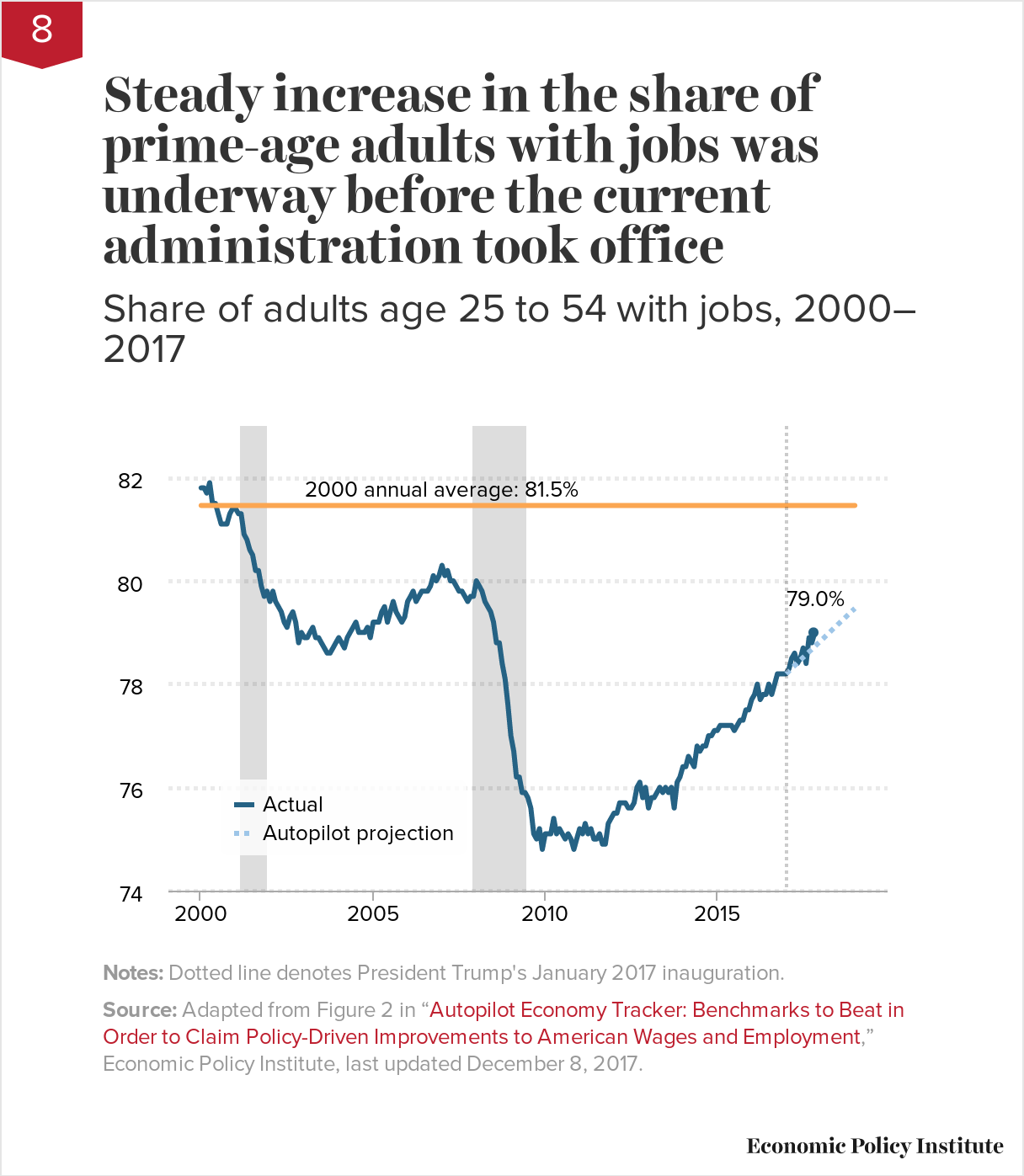
8 ... Steady increase in the share of prime-age adults with jobs was underway before the current administration took office
Share of adults age 25 to 54 with jobs, 2000–2017
ChartData
Notes: Dotted line denotes President Trump's January 2017 inauguration.
Source: Adapted from Figure 2 in “Autopilot Economy Tracker: Benchmarks to Beat in Order to Claim Policy-Driven Improvements to American Wages and Employment,” Economic Policy Institute, last updated December 8, 2017.
In 2017, there was no meaningful pickup in the pace at which the labor market is improving. This figure shows the share of 25- to 54-year-olds (“prime-age adults,” in the jargon of economists) who are employed. From November 2013 to November 2016, this share rose by 2.1 percentage points, or an average of 0.7 percentage points per year. From November 2016 to November 2017, this share rose by 0.8 percentage points.
EPI set up the Autopilot economy tracker at the beginning of 2017 so that claims about changing economic indicators—such as the share of prime-age adults who are employed—could be judged in context. By pinpointing where key indicators were already heading, the tracker shows that the new administration inherited an economy that was already on the upswing. In fact, the economy has made steady and significant progress toward full economic health in every year since 2009. This progress continued in 2017, but not at a pace that was significantly greater than in recent years.
This failure of employment growth to measurably improve under the Trump administration is no surprise. So far, policymakers have enacted no measures that would measurably boost job growth (though plenty of policies have been passed to erode workers’ bargaining power and hurt their wage growth). Employment growth in 2017 simply represents the upswing that was already underway before 2017 began.
Finally, the on-trend improvement that we have seen in 2017 owes more to the Fed’s decisions to not raise interest rates aggressively enough to stomp out job growth than it does to anything the current administration has accomplished. Before too long the Trump administration (and the rest of us) may well regret its decision to not renew Janet Yellen’s term as Fed chair, as her successor may not follow her cautious approach to raising rates.
Share this chart: Share Tweet Embed Download image
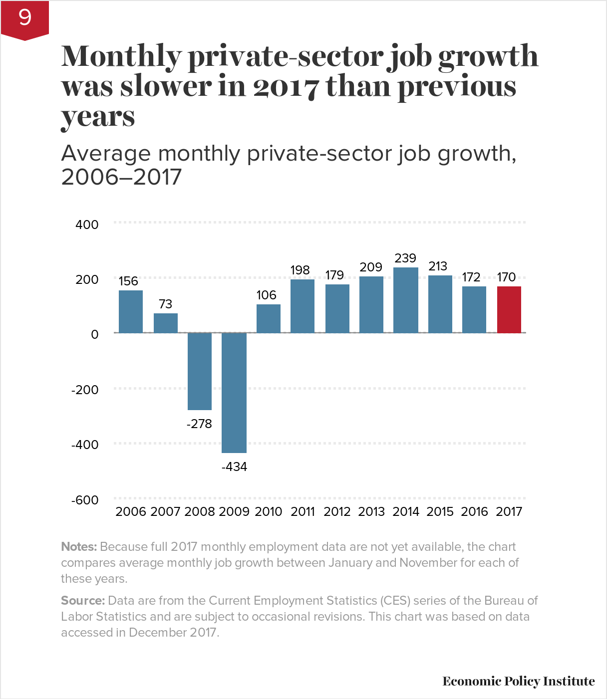
9 ... Monthly private-sector job growth was slower in 2017 than previous years
Average monthly private-sector job growth, 2006–2017
ChartData
Notes: Because full 2017 monthly employment data are not yet available, the chart compares average monthly job growth between January and November for each of these years.
Source: Data are from the Current Employment Statistics (CES) series of the Bureau of Labor Statistics and are subject to occasional revisions. This chart was based on data accessed in December 2017.
Average monthly private-sector job growth in the first 11 months of 2017 fell short of both prior years’ tallies and the Trump administration’s own job creation goals. With an average of 170,000 new jobs being added each month, private-sector job growth in the first 11 months of 2017 was slower than in any year since 2010. Some of this slowdown might be because the economy is moving closer to full employment. The huge stock of unemployed workers created by the Great Recession was largely reabsorbed into the economy in the years following 2009 and boosted job growth above its long-run trend between 2010 and 2016. But we shouldn’t be too quick to assume there’s no more slack in the labor market. For example, the share of prime-age workers with jobs remains quite depressed relative to previous job-market recoveries, as shown in the previous top chart. That suggests there still may be ample room to pull in workers who were idled by the economic crisis.
Early in its term, the Trump administration announced that it would create 25 million new jobs over a decade. Essentially, to meet this claim the economy would need to add an average of 208,000 jobs each month over the next 10 years. This monthly tally is ambitious but actually achievable for the first few of those years if the economy were to continue to absorb idled workers. But as the figure shows, even this moderately ambitious benchmark has been missed in 2017. And this monthly tally would be near impossible to meet toward the end of those 10 years, once most of the idled prime-age workers have been absorbed into the labor market. As EPI analysis has shown, adding 25 million new jobs in a decade would require massive immigration or forcing elderly Americans to work at unprecedented rates.
Share this chart: Share Tweet Embed Download image
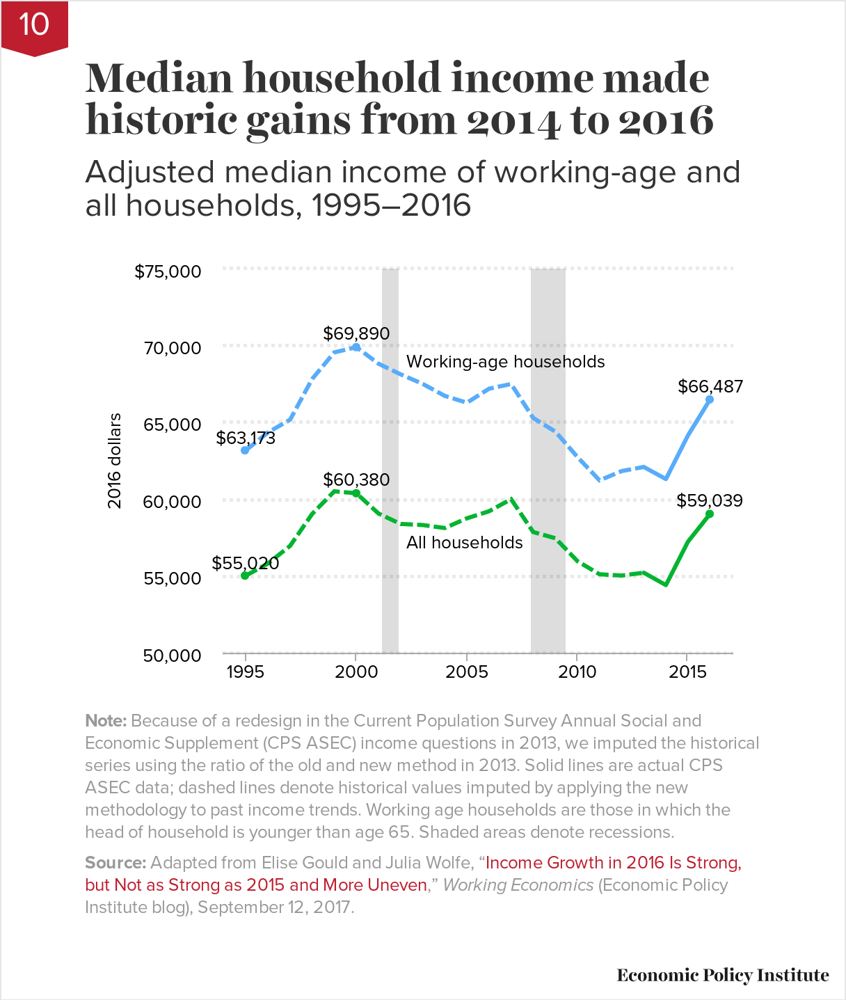
10 ... Median household income made historic gains from 2014 to 2016
Adjusted median income of working-age and all households, 1995–2016
ChartData
Note: Because of a redesign in the Current Population Survey Annual Social and Economic Supplement (CPS ASEC) income questions in 2013, we imputed the historical series using the ratio of the old and new method in 2013. Solid lines are actual CPS ASEC data; dashed lines denote historical values imputed by applying the new methodology to past income trends. Working age households are those in which the head of household is younger than age 65. Shaded areas denote recessions.
Source: Adapted from Elise Gould and Julia Wolfe, “Income Growth in 2016 Is Strong, but Not as Strong as 2015 and More Uneven,” Working Economics (Economic Policy Institute blog), September 12, 2017.
The median income of working-age households grew faster in 2015 than in any previous year. Growth in 2016 was also among the strongest on record for this statistic. This two-year span of historically rapid growth raised the median income of working-age households to $66,487 in 2016, up from $61,304 in 2014.
This growth occurred before the Trump administration was in place. Data on what happened to median household income in the first year of the administration will be available in fall 2018.
The strong growth in household income in 2015 and 2016 does not make up for the brutal hit to household incomes inflicted by the Great Recession and the slow recovery that has followed. But this growth absolutely constituted a welcome new trend and offers hope that middle-class households might really, finally, gain something from the steady recovery.
Share this chart: Share Tweet Embed Download image
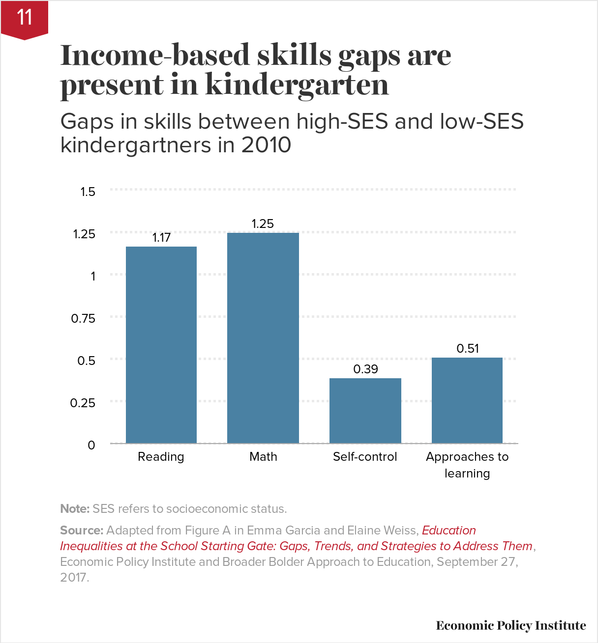
11 ... Income-based skills gaps are present in kindergarten
Gaps in skills between high-SES and low-SES kindergartners in 2010
ChartData
Note: SES refers to socioeconomic status.
Source: Adapted from Figure A in Emma Garcia and Elaine Weiss, Education Inequalities at the School Starting Gate: Gaps, Trends, and Strategies to Address Them, Economic Policy Institute and Broader Bolder Approach to Education, September 27, 2017.
The large and persistent gaps in educational attainment between children of different races and income levels in the United States are profoundly disturbing. If education is to truly serve as a vehicle for upward mobility, these gaps must be closed. We will make little headway toward this goal if we don’t address the many ways that inequality contributes to these gaps.
The chart presents stark evidence that the broader inequities extending all through the American economy contribute to these gaps: the presence of skills gaps before formal education even starts. As the chart shows, low socioeconomic status (SES) children begin kindergarten already well behind their high-SES peers.
Socioeconomic status is a composite of information on parents’ educational attainment and job status as well as household income. The chart compares the average performance of children in the top fifth of the socioeconomic status distribution (high-SES) with the average performance of children in the bottom fifth (low-SES). Skills measured include reading and math and self-control and approaches to learning as reported by teachers. High-SES children score significantly higher in reading and math than their low-SES peers; gaps in both subjects are larger than a full standard deviation. High-SES children also score significantly higher on social and emotional skills, though the gaps are smaller (about one-third to one-half a standard deviation).
Though not reflected in the chart, these gaps are about as wide as they were for the last generation of kindergartners. These education inequalities not only threaten children’s development during their school years but shortchange them by lowering their economic prospects later in life. The lack of true equality of opportunity calls for a shift from blaming schools and teachers for achievement gaps that begin before school starts and that largely persist as children move through school. Instead we should be advancing comprehensive education policies that address the poverty and social inequalities that are the real drivers of low economic performance, and pursuing economic policies that address the broader structural forces that drive poverty and inequality and hold back our children.
Share this chart: Share Tweet Embed Download image
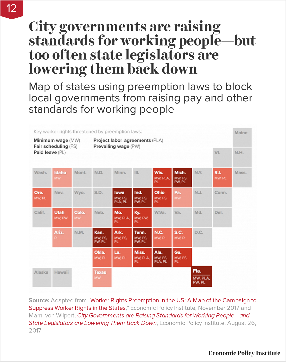
12 ... City governments are raising standards for working people—but too often state legislators are lowering them back down
Map of states using preemption laws to block local governments from raising pay and other standards for working people
City governments are raising standards for working people—but too often state legislators are lowering them back down: Map of states using preemption laws to block local governments from raising pay and other standards for working people
Source: Adapted from 'Worker Rights Preemption in the US: A Map of the Campaign to Suppress Worker Rights in the States,' Economic Policy Institute, November 2017 and Marni von Wilpert, City Governments are Raising Standards for Working People—and State Legislators are Lowering Them Back Down, Economic Policy Institute, August 26, 2017.
Twenty-six states have laws on the books that prohibit cities and counties from enacting policies that raise standards for working people. The map shows the states with such “preemption” laws, and which of the five key worker rights the preemption laws target. In law, the term “preemption” refers to situations in which a law passed by a higher government authority, such as a state legislature, supersedes a law passed by a lower one, such as an ordinance passed by a city council. What the map doesn’t show is the proliferation of preemption laws since the turn of the century, particularly in the last five years. This same map in 2000 would have highlighted only Louisiana and Colorado, which preempted local governments from enacting higher minimum wages. In 2012, the map would have highlighted an additional eight states, with most preempting local minimum wage laws and/or local paid leave laws. In 2013, the number of states with preemption laws tackling other worker rights began its steady ascent.
Today, cities, counties, and other local governments in 25 states can’t set minimum wages higher than the state minimum wage. Local governments in 21 states can’t require that local employers offer paid sick leave or other forms of paid family or medical leave. Local governments in nine states can’t require that employers provide workers with advance notice of work hours or compensation for last-minute schedule changes. Local governments in seven states can’t require that employers with government contracts pay at least the local median wage for the given type of work. And local governments in six states can’t pursue project labor agreements that set basic conditions for worker safety and pay when building roads, bridges, or other municipal infrastructure.
What happened after 2010 to cover the map in red? While waiting for state and federal governments to act, local governments (such as cities and counties) began taking action to raise working conditions in their communities. Before 2012, only five localities had enacted their own local minimum wage laws, but as of 2017, 40 counties and cities have done so. Republicans in control of all branches of state government in a number of states pivoted to state preemption laws to lower those standards back down. A corporate-backed lobbying group, the American Legislative Exchange Council (ALEC), had model preemption laws with sample legislative language ready to adapt. The rapid spread of preemption followed, with the number of states with such laws more than doubling from 10 in 2012 to 26 in 2017, and the number of preemption laws more than quadrupling, from 15 to 67.
Share this chart: Share Tweet Embed Download image
EPI is an independent, nonprofit think tank that researches the impact of economic trends and policies on working people in the United States. EPI’s research helps policymakers, opinion leaders, advocates, journalists, and the public understand the bread-and-butter issues affecting ordinary Americans.
1225 Eye St. NW, Suite 600
Washington, DC 20005
Phone: 202-775-8810 • epi@epi.org
©2016 Economic Policy Institute
Projects
The Perkins Project on Worker Rights and Wages
Tracking the wage and employment policies coming out of the White House, Congress, and the courts.
State of Working America Data Library
Authoritative, up-to-date data on the living standards of American workers.
Inequality.is
Interactive tools and videos bringing clarity to the national dialogue on economic inequality.
Affiliated programs
Economic Analysis and Research Network (EARN)
A network of state and local organizations improving workers' lives through research and advocacy.
About EPI
Staff
Board of Directors
Jobs at EPI
Contact us
Why give to EPI
Newsroom
Newsletter
Events
Donate