
Date: 2024-07-17 Page is: DBtxt003.php txt00015508
Investing
Stock Market Performance
S&P 500: It's All In The Numbers And The Numbers Never Lie
Burgess COMMENTARY
Peter Burgess
S&P 500: It's All In The Numbers And The Numbers Never Lie
The Fortune Teller
REITs, BDCs, Bonds, etc., dividend growth investing, Deep Value, long/short equity
MARKETPLACEThe Wheel of FORTUNE
(11,506 followers)
Summary
We all talk much about FAANG and/or the tech sector. However, the market is far greater and more interesting than that.
Stepping back and looking at the broader picture is never a bad thing. It may reveal both hits and dogs that you may have missed.
Almost everything you wish to (or should) know about the S&P 500 is right here; and then some.
Join me in a fascinating (though long) journey into (and through) the guts of the most popular index/ETF.
Once done with this 'operation', I assure you that you will come out cleaner and healthier. Unfortunately, I can't promise that you'll be happier too.
Members of my private investing community, The Wheel of FORTUNE, receive real-time trade alerts on this idea and many more. Learn more today >>
Introduction
With 60% of 2018 already behind us and as the S&P 500 (SPY) is on the verge of making a new all time - we thought that it's as a good time as any to look at the YTD stats of the index.
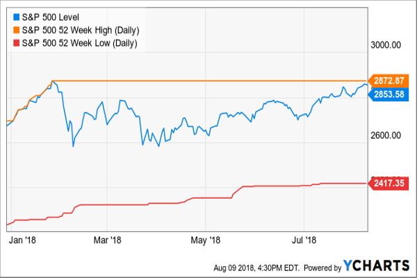
Chart^SPX data by YCharts
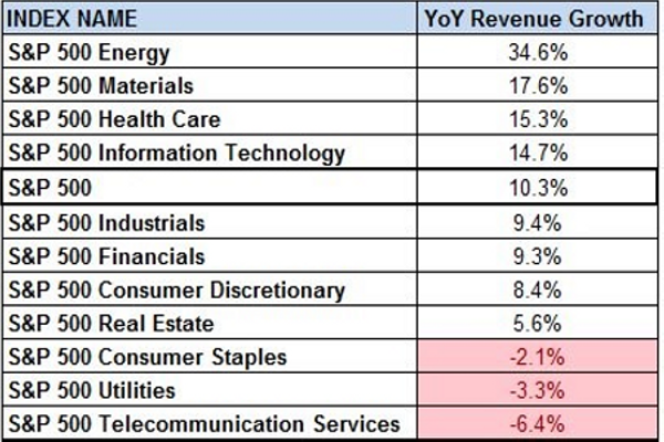
S&P 500 Q2/2018 Y/Y Sales Growth by Sector
... Energy (XLE): 34.6%
... Materials (XLB): 17.6%
... Healthcare (XLV, VHT):
... Information Technology (XLK, VGT):
... S&P 500 (SPY):
... Industrials (XLI):
... Financials (XLF, VFH):
... Consumer Discretionary (XLY):
... Real Estate (VNQ, VNQI, IYR):
... Consumer Staples (XLP):
... Utilities (XLU):
... Telecommunication Services (XLC, VOX)
Source: S&P Dow Jones Indices, Bloomberg, Thomson Reuters, Author data
With oil (OIL) prices recovering substantially - it's only natural for the energy sector's sales to jump accordingly
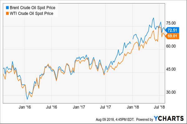
ChartBrent Crude Oil Spot Price data by YCharts
S&P 500 Q2/2018 Y/Y Earnings Growth by Sector
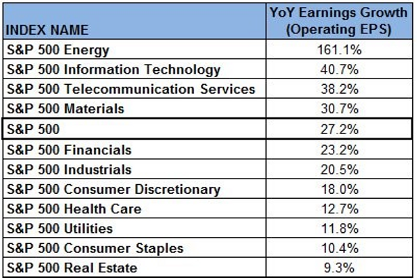
High correlation among the top sectors between revenue and earnings. Energy, tech and materials are among the top four in both categories. Interestingly, healthcare - ranked third in revenue growth - is only ranked eighth when it comes to earnings. The telecommunication sector, however, is heading in the exact opposite way; from the bottom of the revenue growth ranking it jumped all the way to third place when it comes to earnings growth.
Perhaps investing in AT&T (T), Verizon (VZ), China Mobile (CHL) or Vodafone (VOD) isn't that bad after all? Well, it doesn't look that way thus far (YTD)...
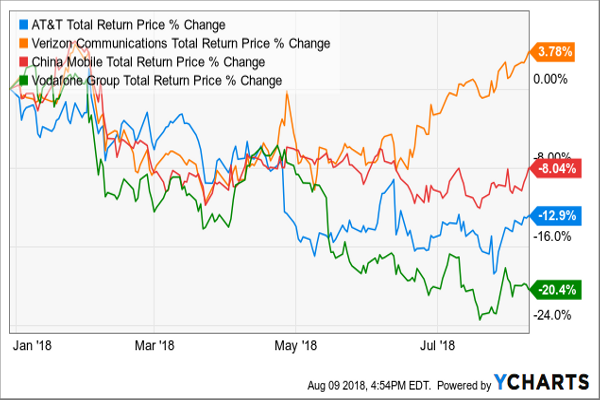
ChartT Total Return Price data by YCharts
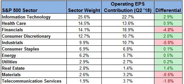
S&P 500 Sector Weights versus Earnings Contribution
Source: S&P Dow Jones Indices, Bloomberg, Thomson Reuters, Author data
The largest negative discrepancy can be found - surprise, surprise - in the tech sector that has contributed 2.9% less EPS to the S&P 500 compare to its relative weight in index.
The largest negative discrepancy can be found in the financial sector that has contributed 4.8% more EPS to the S&P 500 than its weight in index.
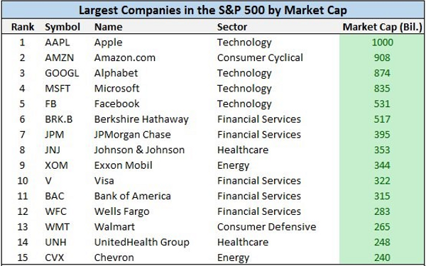
Largest Companies in the S&P 500 by Market Cap
Tech rules the world with the top-5 all belonging (directly or indirectly) to the leading sector: Apple (AAPL), Amazon.com (AMZN), Alphabet (GOOGL, GOOG)*, Microsoft (MSFT), Facebook (FB)**.
*Further-recent coverage can be found here. **Further-recent coverage can be found here.
The financial sector also sent five names to the top-15 list, mostly banks. Berkshire Hathaway (BRK.A, BRK.B) is ranked 6th, followed by JPMorgan Chase (JPM) at 7th,Visa (V), Bank of America (BAC) at 11th and Wells Fargo (WFC) at 12th.
Both Healthcare and energy sectors are represented in this list by two names each. While Johnson & Johnson (JNJ) at 7th and UnitedHealth Group (UNH) at 14th represent the former, Exxon Mobil (XOM) at 9th and Chevron (CVX) at 15th represent the latter.
Walmart (WMT) at 13th is left alone, with no 'colleagues' around, to represent the consumer staples sector. That, of course, unless you move AMZN from tech into a more consumer-matching type of sector.
Source: S&P Dow Jones Indices, Bloomberg, Thomson Reuters, Author data
Note that most of the S&P 500 sectors (Materials, Industrials, Consumer Discretionary, Real Estate, Utilities and Telecommunication Services) aren't represented in the above list at all.
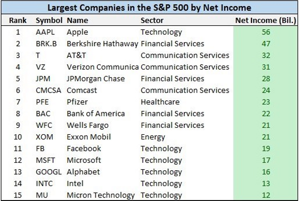
Largest Companies in the S&P 500 by Net Income
I find it fascinating to see the correlation between the largest corporations in the world (from a market-cap perspective) to those that generate the most money of them all.
Source: S&P Dow Jones Indices, Bloomberg, Thomson Reuters, Author data
Although nine of the largest corporations on the planet (AAPL, BRK, JPM, BAC, WFC, XOM, FB, MSFT, GOOGL) are also making it to the list of the most profitable corporations on the plant, there are six names (or 40%) that don't. Aside of the notable AMZN, we have V, JNJ, XOM, CVX and WMT dropping from the above list. Instead, we see six old and new 'cash cow' faces:
... Half of those are telecommunication services providers: T, VZ and Comcast (CMCSA)
... Two belong to the massively developing semiconductor segment (part of the tech sector): Intel (INTC) and Micron Technology (MU).
... One belong to the healthcare sector: the good-old horse Pfizer (PFE).
... Largest Companies in the S&P 500 by Revenue
After we looked at the largest corporation based on the bottom line (net income), it's time to look at the heavyweight stocks based on the top line - revenue.
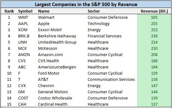
Source: S&P Dow Jones Indices, Bloomberg, Thomson Reuters, Author data
You would thought that we won't see too many unfamiliar faces at this point. Wring! Indeed, eight companies on that list already appeared in at least one of the previous two lists: WMT (ranked 1st here!), AAPL, XOM, BRK, UNH, AMZN, T and CVX. Nevertheless, no less than seven names are new entries, out of which four belong to the healthcare, revenue-drawn, sector: McKesson (MCK) at 6th, CVS Health (CVS) at 8th, AmerisourceBergen (ABC) at 9th and Cardinal Health (CAH) at 15th.
The other three are consumer-related, with two car-makers - Ford Motor (F) and General Motors (GM) - and one wholesale chain - Costco Wholesale (COST).
I touched upon both F and GM when I wrote about the overvalued-hyped Tesla (TSLA).
Largest Companies in the S&P 500 by Number of Employees
Finally, let's see who are the biggest employers among the S&P 500 index' constitutes. That should bring up some few names to the mix.
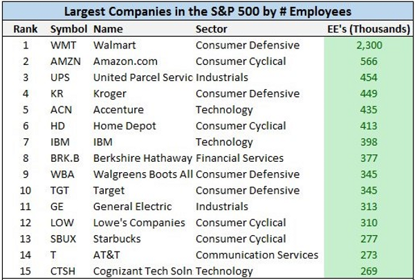
Source: S&P Dow Jones Indices, Bloomberg, Thomson Reuters, Author data
Only four companies - WMT, AMZN, BRK and T - in the above list are old-familiar faces. The other eleven corporations that are part of the above list are all making their debut appearance in any of the S&P 500 top-15 lists:
... United Parcel Service (UPS) at 3rd
... Kroger (KR) at 4th
... Accenture (ACN) at 5th
... Home Depot (HD) at 6th
... IBM (IBM) at 7th
... Walgreens Boots Alliance (WBA) at 9th
... Target (TGT) at 10th
... General Electric (GE) at 11th
... Lowe's Companies (LOW) at 12th
... Starbucks (SBUX) at 13th
... Cognizant Tech Solns (CTSH) at 15th
Unsurprisingly, this list is very much consumer-oriented with few of the world's most famous/popular retail brands starring in it.
In case you wonder where McDonald's (MCD) has gone, the company itself declares on having 'only' 235K employees (as at end of 2017); see page 3 here.
The above four lists are, to a certain/large extent, a stamp for both quantity (size/weight) and quality (profitability/cash). Nonetheless, when it comes to investing and the stock market, neither quantity nor quality provides any guarantee for the stock to perform as good as the size and/or profitability implies. Therefore, let's see if any of the 'bold and beautiful' names from the above four lists make it into the list of the top-performing stocks YTD.
The Best Performing Stocks in the S&P 500 this Year
So far this year, equities are leading the way across the main asset classes. Nevertheless, only one name, the almighty AMZN, has made it from the above lists into the below list.
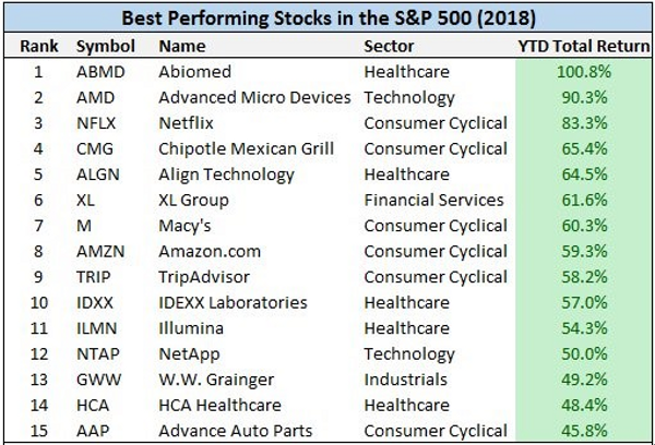
Source: S&P Dow Jones Indices, Bloomberg, Thomson Reuters, Author data
All other, fourteen, names represent great but not necessarily giant companies. Aside of AMZN, we find here:
... Five healthcare-related corporations: Abiomed (ABMD), Align Technology (ALGN), IDEXX Laboratories (IDXX), Illumina (ILMN) and HCA Healthcare (HCA)
... Five consumer discretionary related corporations: Netflix (NFLX), Chipotle Mexican Grill (CMG), Macy's (M), TripAdvisor (TRIP) and Advance Auto Parts (AAP)
... Two technology-related corporations: Advanced Micro Devices (AMD)*** and NetApp (NTAP)
... One industrials-related corporation: W.W. Grainger (GWW)
... One financials -related corporation: XL Group (XL)
... ***Further-recent coverage can be found here.
And from the best to the worst...
The Worst Performing Stocks in the S&P 500 this Year
I don't expect to see any of the largest, most successful, corporations on this list for sure.
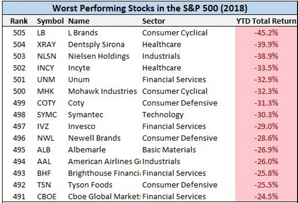
Source: S&P Dow Jones Indices, Bloomberg, Thomson Reuters, Author data
How to put it nicely? I hope that you don't own any of the following over the past eight months: L Brands (LB), Dentsply Sirona (XRAY), Nielsen Holdings (NLSN), Incyte (INCY), Unum (UNM), Mohawk Industries (MHK), Coty (COTY), Symantec (SYMC), Invesco (IVZ), Newell Brands (NWL), Albemarle (ALB), American Airlines Group (AAL), Brighthouse Financial (BHF), Tyson Foods (TSN), or Cboe Global Markets (CBOE).
Interestingly, in order to join the best-performing list a stock has to deliver at least 45.8% total return YTD. Nonetheless, in order to join the worst-performing list a stock has to deliver a negative total return of -24.5% YTD. That's only about half of the what it takes to make it to the positive list. Probably another way to look at how stretched the market is.
Speaking of which... The below table is looking at this very same point.
CAPE Ratio
The below table shows the level of the CAPE ratio during periods of bear markets.
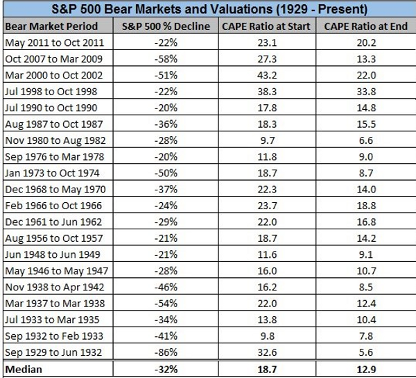
Source: S&P Dow Jones Indices, Bloomberg, Thomson Reuters, Author data
As you can see, a bear market starts (based on the median reading) when the CAPE ratio is at 18.7. Where are we today you ask? Well, 'slightly' above that level... at 33.22
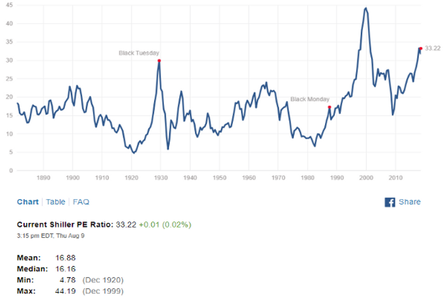
Source: Shiller PE Ratio
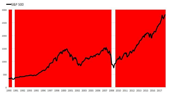
If you invested $1 in the S&P 500 back in 1990, your investment now worth about $13.70; that's a stunning total return of 1270%.The red area represents periods when the CAPE ratio was above its long-term average.
Interim-conclusion:
1. 'The market can remain irrational longer than you can remain solvent.'The market may be stretched now. Nevertheless, if we believe based on the CAPE ratio history, it's stretched at almost any time over the past two decades.
2. 'Just pick a broad index like the S&P 500. Don't put your money in all at once; do it over a period of time.' Warren Buffett may have a point after all.
On the other hand (see below)...
Valuation
The CAPE ratio is obviously a commonly-used gauge to assess the market valuation. Here are two more gauges to assess the market valuation:
1. The 'Buffett Indicator', measuring the ratio of a country's stock market capitalization to the overall GDP of the country, is indicating that stocks are more overvalued now than they were before the dot-com bubble burst or the great recession started!

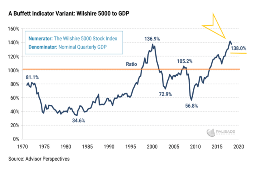
Perhaps this is the reason that Warren Buffett has grown the cash pile of Berkshire Hathaway to over $111B!

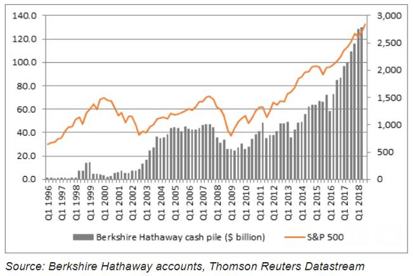
So both the 'Buffett Indicator' as well as the 'Buffett Cash Pile' should, at the very minimum, have investors worried.
2. The 'Big-4 indicator' and no, I don't refer to the four largest accounting firms... Get this: The combined market-cap of Apple, Amazon, Google, and Microsoft today is 11x larger than it was on March 9th 2009.
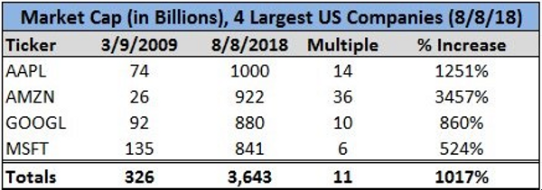
Source: Bloomberg, Thomson Reuters, Author data
Does this means nothing? Probably not. Yet, it's spooky...!
Volatility
Source: S&P Dow Jones Indices, Bloomberg, Thomson Reuters, Author data
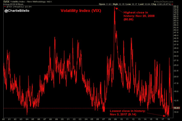
The equity volatility index, aka VIX (VXX) or 'fear factor', has just hit its lowest level since January.
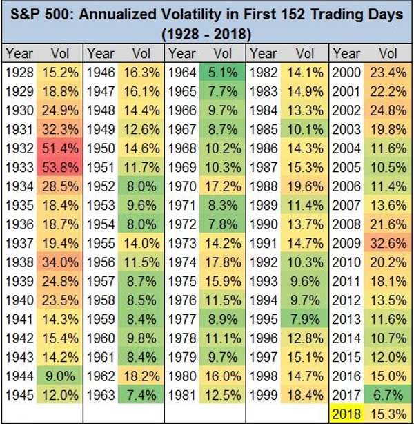
S&P 500 annualized volatility through the first 152 trading days: 15.3%.That's right in line with the historical average going back to 1928.
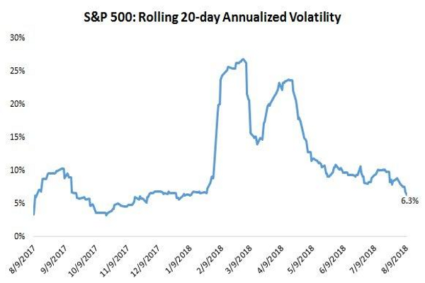
Source: S&P Dow Jones Indices, Bloomberg, Thomson Reuters, Author data
The equity volatility index, aka VIX (VXX) or 'fear factor', has just hit its lowest level since January.
S&P 500 annualized volatility over the last 20 trading days: 6.3%.This the lowest level since early January this year.

Source: S&P Dow Jones Indices, Bloomberg, Thomson Reuters, Author data
Reminder: What did we get at the end of January this year? Bravo!, a market correction
Maximum Drawdown
The S&P 500's maximum drawdown in 2018: -10.2% (on a closing basis).The median intra-year drawdown since 1928: -13.1%.

Source: S&P Dow Jones Indices, Bloomberg, Thomson Reuters, Author data
Profit Margins
S&P 500 profit margins rose to 11.7% in the 2nd quarter, their highest level in history!
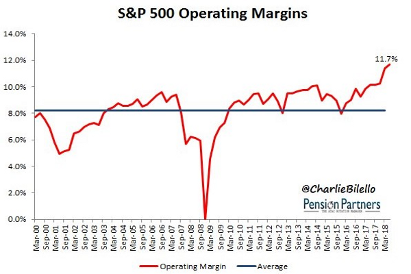
Here is how this looks on a sector-by-sector basis:
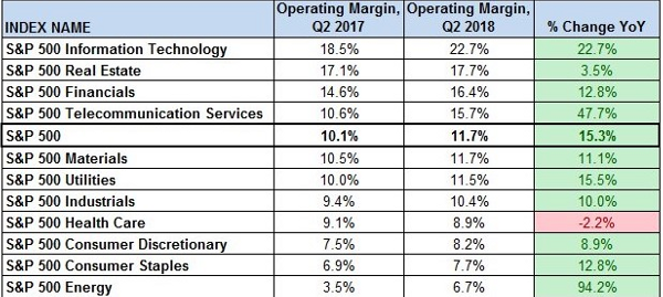
Source: S&P Dow Jones Indices, Bloomberg, Thomson Reuters, Author data
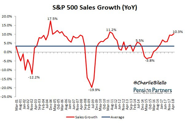
Sales Growth
With 75% of companies reported, S&P 500 Sales up +10.3% Y/Y.On pace for strongest growth rate since Q3/2011.
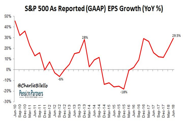
EPS
With 75% of companies reported, S&P 500 EPS up +29.5% Y/Y.On pace for strongest growth rate since Q4/2010.
Numbers Never Lies
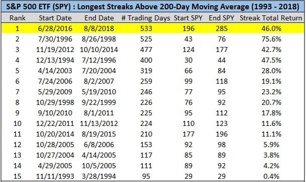
Last but not least, the SPY has not closed below its 200-day moving average ('DMA') since June 2016. That's the longest run ever!
Source: S&P Dow Jones Indices, Bloomberg, Thomson Reuters, Author data
Bottom Line
What should you take out of all of this?
Well, after so many charts I rather leave this for you, dear reader, to decide.
I do hope that you enjoyed this fascinating journey that turned the S&P 500 upside down and looked at it from almost each and every aspect.
In case this has been not only interesting but also helpful for you in your investment decisions - I've done my bit. Just to make it clear - that's 'bit', not Bitcoin (BTC-USD)!
It's only when the tide goes out do you discover who's been swimming naked.' - Warren Buffett
Truth is that in order to see who's been swimming naked what you need is either for the tide to go out or for a Sultan of Swings to step in...
----------------------------------------------------------------------------------------
Erdogan Defiant as Turkey Slides Toward Financial Crisis Erdogan Defiant as Turkey Slides Toward Financial Crisis
Author's note: If you like this article, please scroll up and follow us. In order to make the most out of following us, please make sure that you're not only following us, but also doing so at real time:
That's the only way to get notifications regarding both articles and blog posts that we publish at real time.
Blog Posts notifications are only being sent to those who follow an author at real time. In order to receive notifications regarding both articles and blog posts (such as this one) that we publish regularly at real time you must ensure that you're (not only) following us (but also doing so) at real time. In order to follow us at real time go to Author Email Alerts, where the list of all the authors you follow appear, and make sure that 'get e-mail alerts' is ticked on!