
Date: 2026-04-18 Page is: DBtxt003.php txt00016492
Population
Data and Presentation ... but Missing Management
Global Agenda Cities and Urbanization Future of Economic Progress Inclusive Growth Framework ... The world’s 7.5 billion people, in one chart
Population has been an interest of mine for a very long time ... and how people fit into the global socio-enviro-economic system. I argue that it should be people that make the world go round and not money ... but clearly it is the money that is coming out on top with billions of people excluded. Country level data are not very helpful because they are distorted by an obscene degree of inequality which conveniently disappears as a datapoint in most country level reporting! Better metrics are needed that enable drill-down to the individual and aggregate in a meaningful way to those with responsibility for leadership and decision making.
Peter Burgess
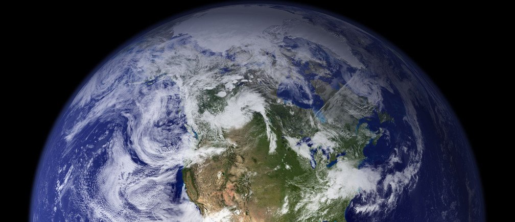 This spectacular 'blue marble' image is the most detailed true-color image of the entire Earth to date, using a collection of satellite-based observations, scientists and visualizers stitched together months of observations of the land surface, oceans, sea ice, and clouds into a seamless, true-color mosaic of every square kilometer of Earth. Much of the information contained in this image came from a single remote-sensing device - NASA's Moderate Resolution Imaging Spectroradiometer, or MODIS. REUTERS/NASA Goddard Space Flight Center/Handout (UNITED STATES) FOR EDITORIAL USE ONLY - GM1DVUYTDEAA Where in the world is everyone? Image: REUTERS/NASA Goddard Space Flight Center/Handout
This article is published in collaboration with
Visual Capitalist
It’s a very simple question, but it’s also hard to get an accurate sense of the answer by browsing through a lengthy table of country-level population data.
That’s because there are close to 200 countries spread around the globe, with populations ranging from near 1.4 billion (China or India) to countries a mere 0.001% of that size. How is it possible to do the mental math in interpreting such a wide range of data points simultaneously?
This spectacular 'blue marble' image is the most detailed true-color image of the entire Earth to date, using a collection of satellite-based observations, scientists and visualizers stitched together months of observations of the land surface, oceans, sea ice, and clouds into a seamless, true-color mosaic of every square kilometer of Earth. Much of the information contained in this image came from a single remote-sensing device - NASA's Moderate Resolution Imaging Spectroradiometer, or MODIS. REUTERS/NASA Goddard Space Flight Center/Handout (UNITED STATES) FOR EDITORIAL USE ONLY - GM1DVUYTDEAA Where in the world is everyone? Image: REUTERS/NASA Goddard Space Flight Center/Handout
This article is published in collaboration with
Visual Capitalist
It’s a very simple question, but it’s also hard to get an accurate sense of the answer by browsing through a lengthy table of country-level population data.
That’s because there are close to 200 countries spread around the globe, with populations ranging from near 1.4 billion (China or India) to countries a mere 0.001% of that size. How is it possible to do the mental math in interpreting such a wide range of data points simultaneously?
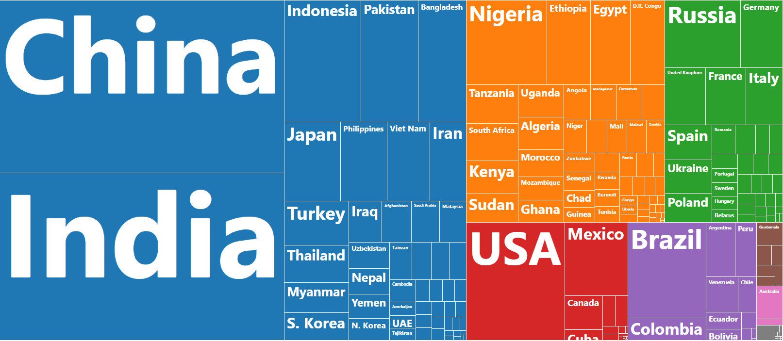 Visualizing the world’s population
Today’s data visualization comes to us from PopulationPyramid.net, a fantastic resource for data on global population numbers.
It allows us to see the location of the world’s 7.5 billion people by resizing countries based on their populations and then coloring and organizing them by region.
This simple application of data visualization makes it more intuitive to comprehend where people live around the globe, as well as how different countries compare in size.
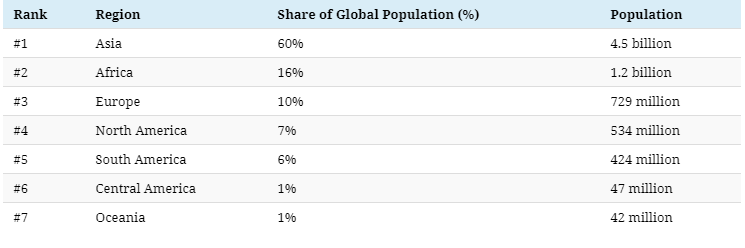
Regional populations
The first thing you might notice on the graphic is the relative size of regions, with Asia taking up a whopping 60% of the visual space.
Here are those numbers by region broken down further:
Visualizing the world’s population
Today’s data visualization comes to us from PopulationPyramid.net, a fantastic resource for data on global population numbers.
It allows us to see the location of the world’s 7.5 billion people by resizing countries based on their populations and then coloring and organizing them by region.
This simple application of data visualization makes it more intuitive to comprehend where people live around the globe, as well as how different countries compare in size.
Regional populations
The first thing you might notice on the graphic is the relative size of regions, with Asia taking up a whopping 60% of the visual space.
Here are those numbers by region broken down further:
 When you look at it this way, you can really see how the math breaks down.
About 75% of people reside in Asia or Africa. Meanwhile, the regions of Europe, North America, South America, and Oceania just total together to 25% of the mix.
There are some countries that are clear standouts on the data visualization.
For example, China and India combine to 2.7 billion people, together accounting for 36% of the total global population.
Those heavyweights aside, there are other notable countries that take up significant amounts of real estate on the visualization as well:
The United States, Indonesia, Brazil, and Pakistan rank between #3 and #6, and have about a billion people between them.
Nigeria, which is #7 on the list, has the world’s fastest growing megacity within its borders. Further, Bangladesh is also a noteworthy entry since it is one of the densest populations globally, with 1,138.9 people per square kilometer of land.
A final look at global population
This isn’t the first time we’ve shown you a data visualization that organizes the global population – here’s one we previously published that shows each country in a bubble chart:
When you look at it this way, you can really see how the math breaks down.
About 75% of people reside in Asia or Africa. Meanwhile, the regions of Europe, North America, South America, and Oceania just total together to 25% of the mix.
There are some countries that are clear standouts on the data visualization.
For example, China and India combine to 2.7 billion people, together accounting for 36% of the total global population.
Those heavyweights aside, there are other notable countries that take up significant amounts of real estate on the visualization as well:
The United States, Indonesia, Brazil, and Pakistan rank between #3 and #6, and have about a billion people between them.
Nigeria, which is #7 on the list, has the world’s fastest growing megacity within its borders. Further, Bangladesh is also a noteworthy entry since it is one of the densest populations globally, with 1,138.9 people per square kilometer of land.
A final look at global population
This isn’t the first time we’ve shown you a data visualization that organizes the global population – here’s one we previously published that shows each country in a bubble chart:
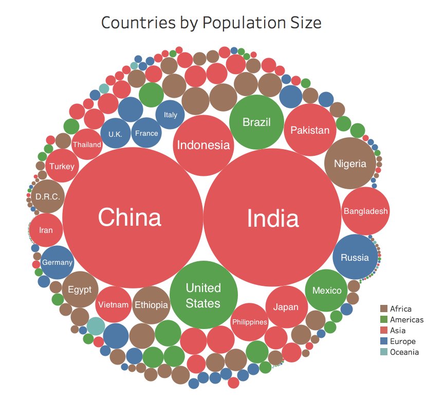 While this uses slightly older data, it is still interesting to see how data visualization can help us understand a complex and wide-ranging set of data that is relevant to everyday life.
Have you read?
This stunning map visualises 200 years of US population density
The 'hidden figures' in population genetics
Mapped: The median age of the population on every continent
The 10 most populous countries
New report: Globalization 4.0 Read the report
Most Popular
Chicago makes history electing Lori Lightfoot as first black woman mayor Karen Pierog and Brendan O'brien · Reuters 03 Apr 2019
These countries give the most aid - and are the most principled about it Douglas Broom 04 Apr 2019
MENA’s growing young population is a huge opportunity – if we get it right Geert Cappelaere 04 Apr 2019
More on the agenda Explore context
Cities and Urbanization
Explore the latest strategic trends, research and analysis
Which countries do people live in, globally?